
shadcn-ui/ui
#41 this week
Composable, accessible components with thoughtful defaults. Build your own component library with code you can customize, extend, and make your own.
124.1K stars
10.5K forks
124.1K GitHub watchers
Updated 9/17/2026
Build with Backblaze B2
SDKs, agent skills, IDE extensions, and reference pipelines from Backblaze Labs. All open source.
Loading star history...
Use Cases & Benefits
- shadcn/ui provides accessible, customizable UI components designed for easy integration with popular frameworks like React and Next.js.
- Built with TypeScript, TailwindCSS, and Radix UI, it emphasizes modern, scalable front-end technologies and design consistency.
- Its MIT license and open-source nature encourage community contributions and flexible usage in commercial and personal projects.
- With over 93,000 stars and 6,500 forks since early 2023, it demonstrates strong adoption and popularity in the developer community.
- Ideal for developers seeking a ready-to-use, accessible component library to accelerate UI development in React and Next.js applications.
About ui
shadcn/ui
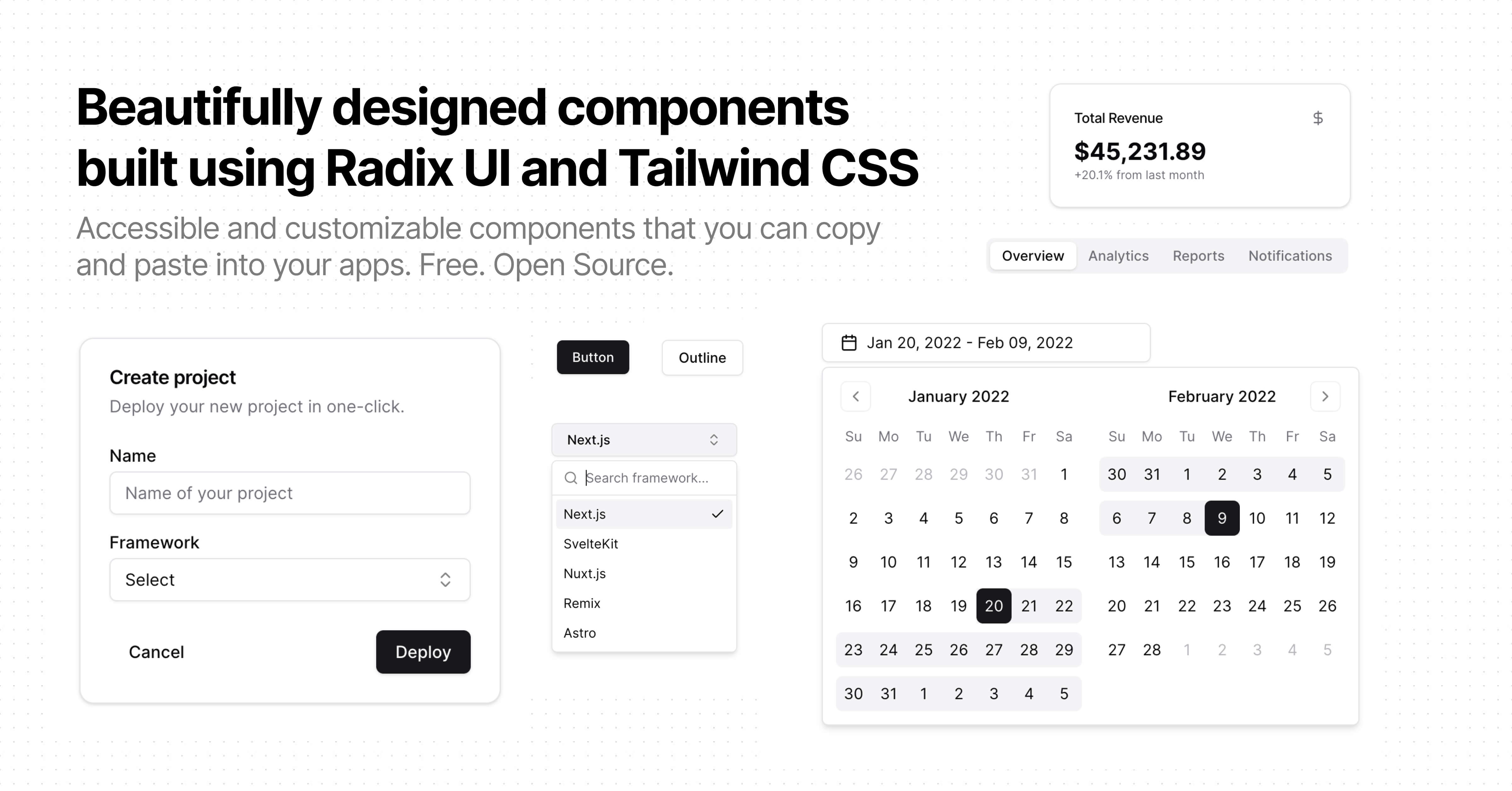
Accessible and customizable components that you can copy and paste into your apps. Free. Open Source. Use this to build your own component library.
Documentation
Visit http://ui.shadcn.com/docs to view the documentation.
Contributing
Please read the contributing guide.
License
Licensed under the MIT license.
Discover Repositories
Search across tracked repositories by name or description